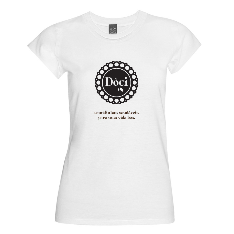
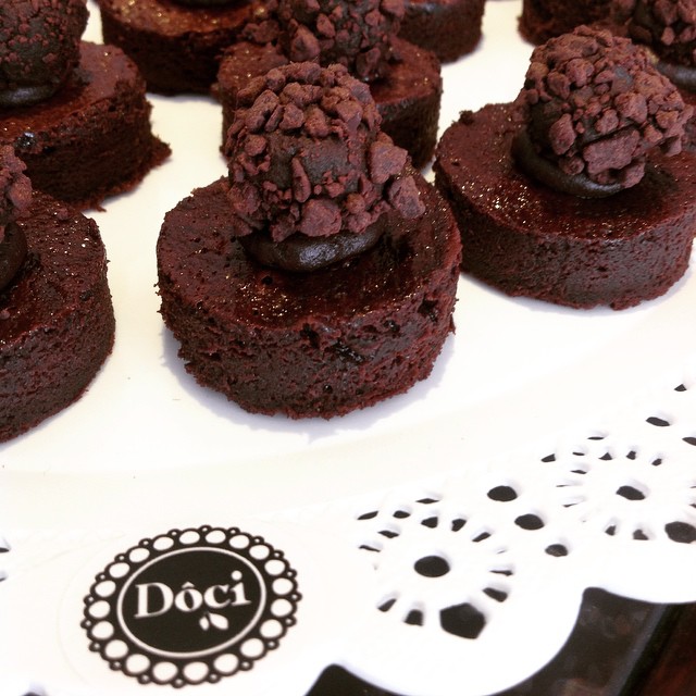
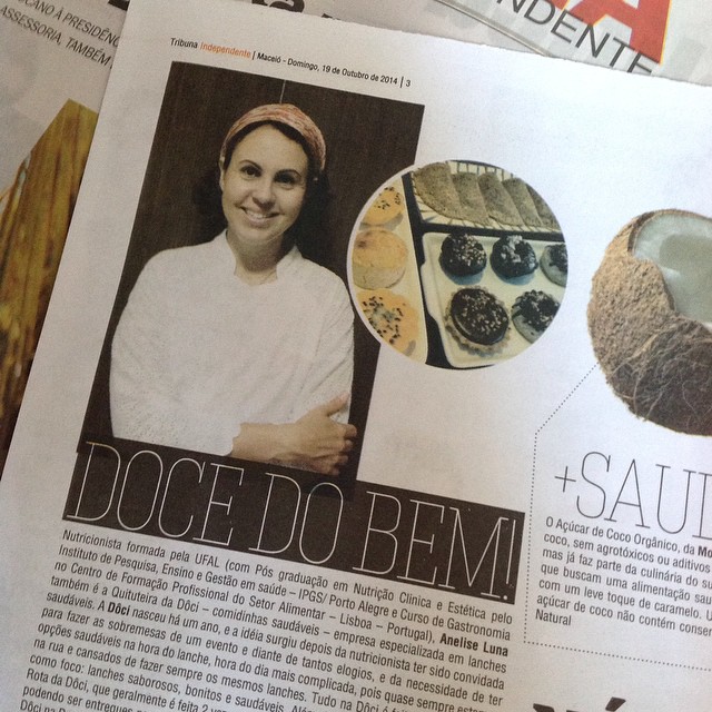
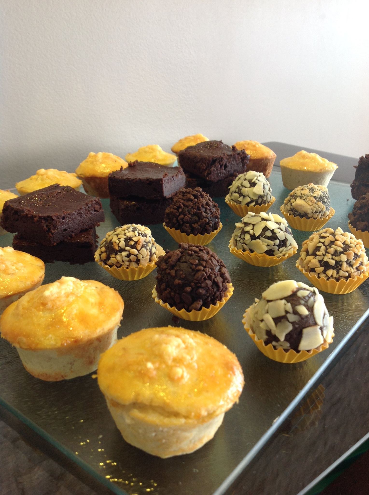
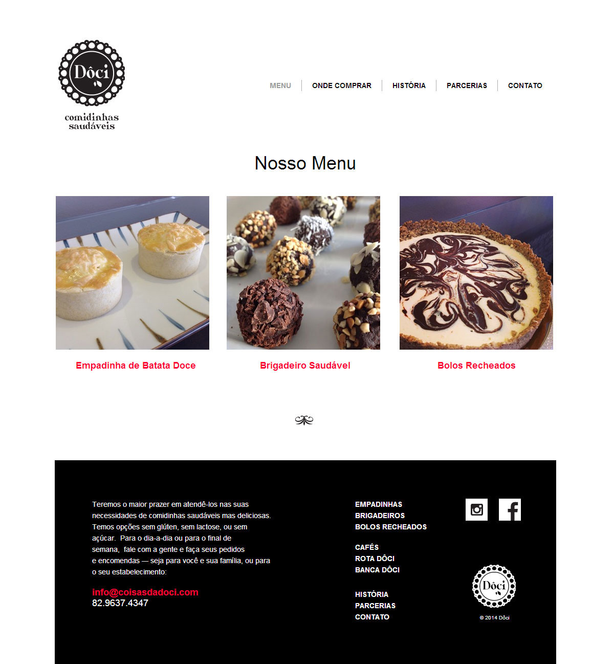
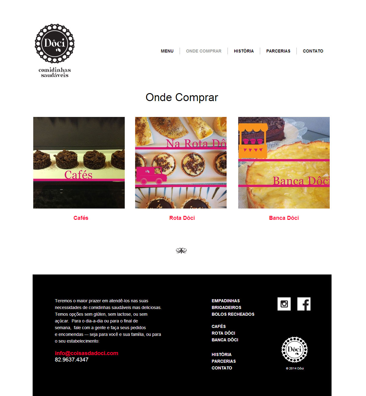
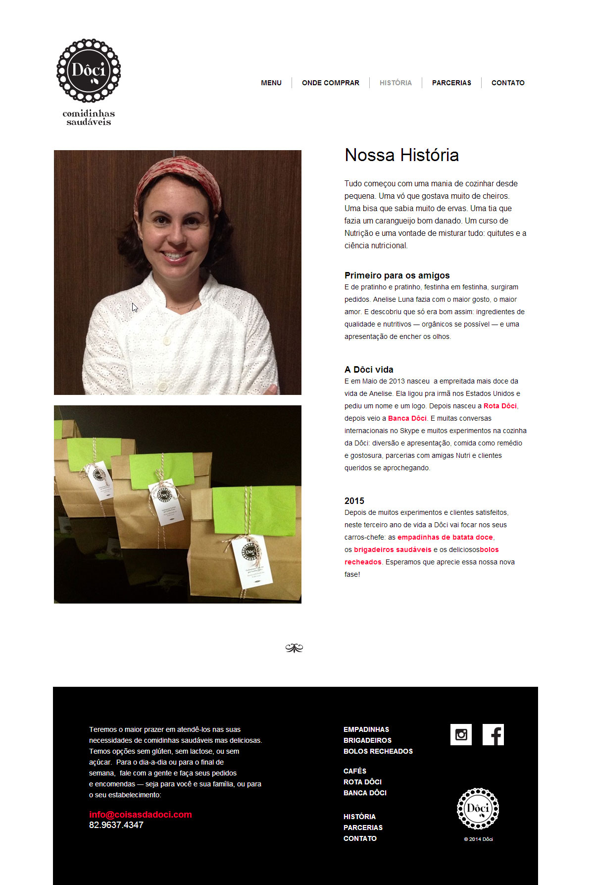
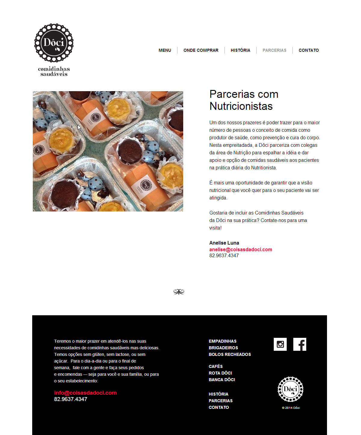
Dôci
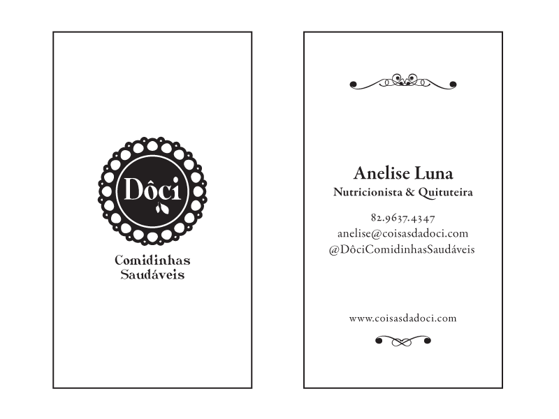
Strategy, marketing, copywriting, packaging, web site, photography and identity design (logo, tags, labels, stickers, business cards, menus, signs, business materials, web banners, fliers) for this startup of healthy finger food. Dôci is owned by a nutritionist and talented cook who is combining these two discipline into a new concept, a nich in her hometown: the art of eating delicious food with attention to nutrition. The word "doci" means "sweet" in Portuguese — tweaked to sound like the accent of the Northeast of Brasil. It is also written this way in Cape Verde. The name and logo proved to be the right direction as the name easily caught up on people's mouth. Inspired on a desert dish, the visual mark, mostly used in black and white, aimed to evoke simplicity, snacks eaten as in the old-times, homemade and artisanal. So far, the branding has touched that homey soft spot in everybody's stomach. Of course, the food IS delicious and sweetly presented — the star of the show.
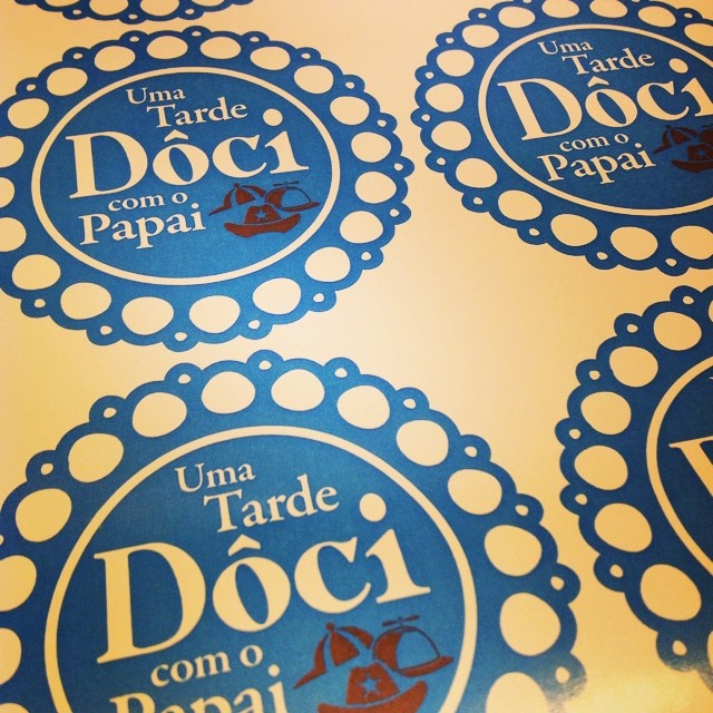
/// Special Logos for Special Dates
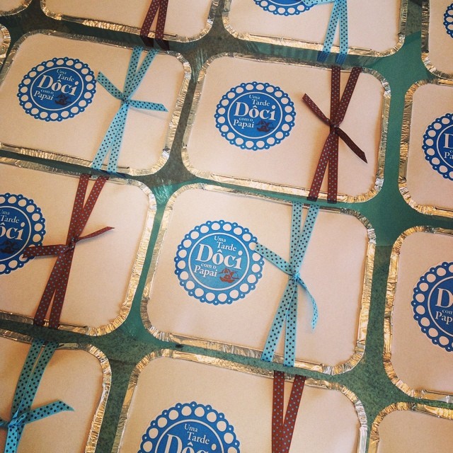
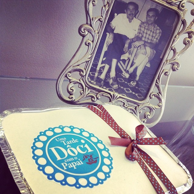
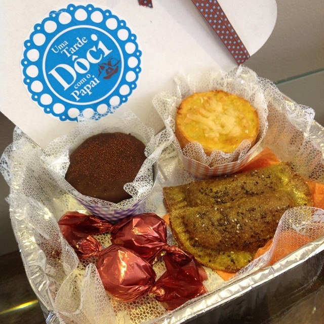
/// Father's Day Package
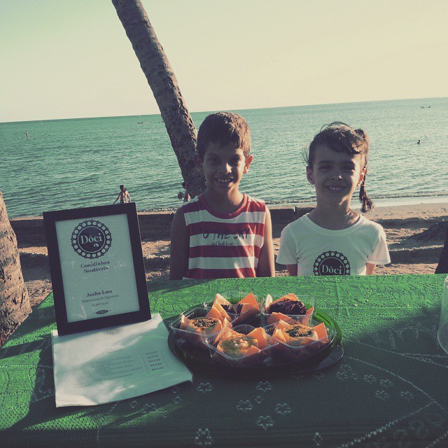
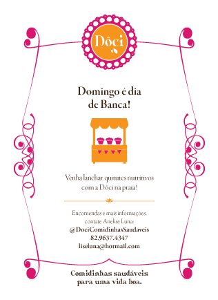
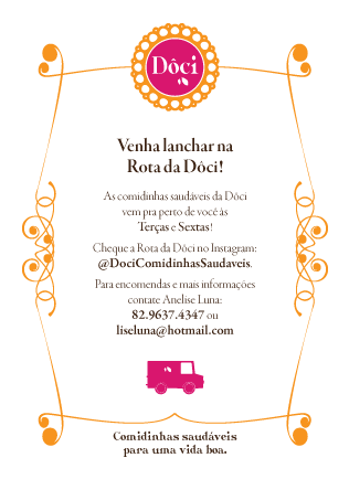
/// Fliers for Special Events: The Route and The Stand

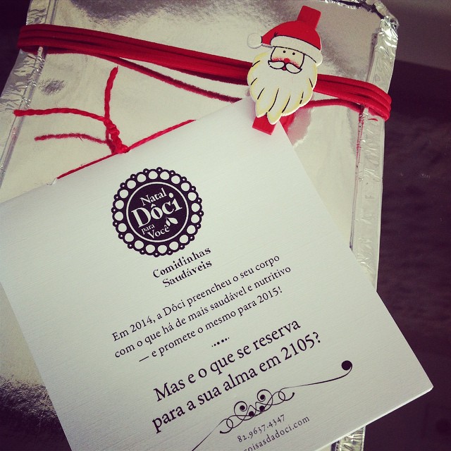
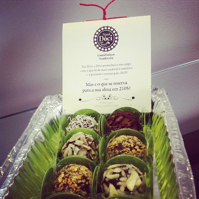
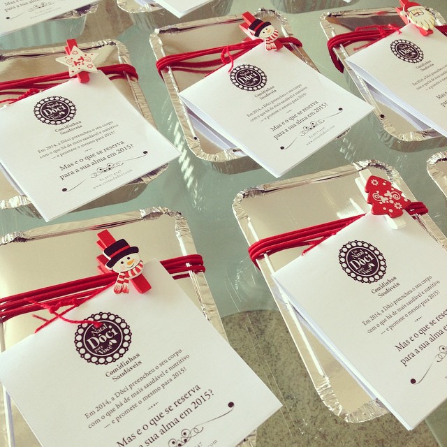
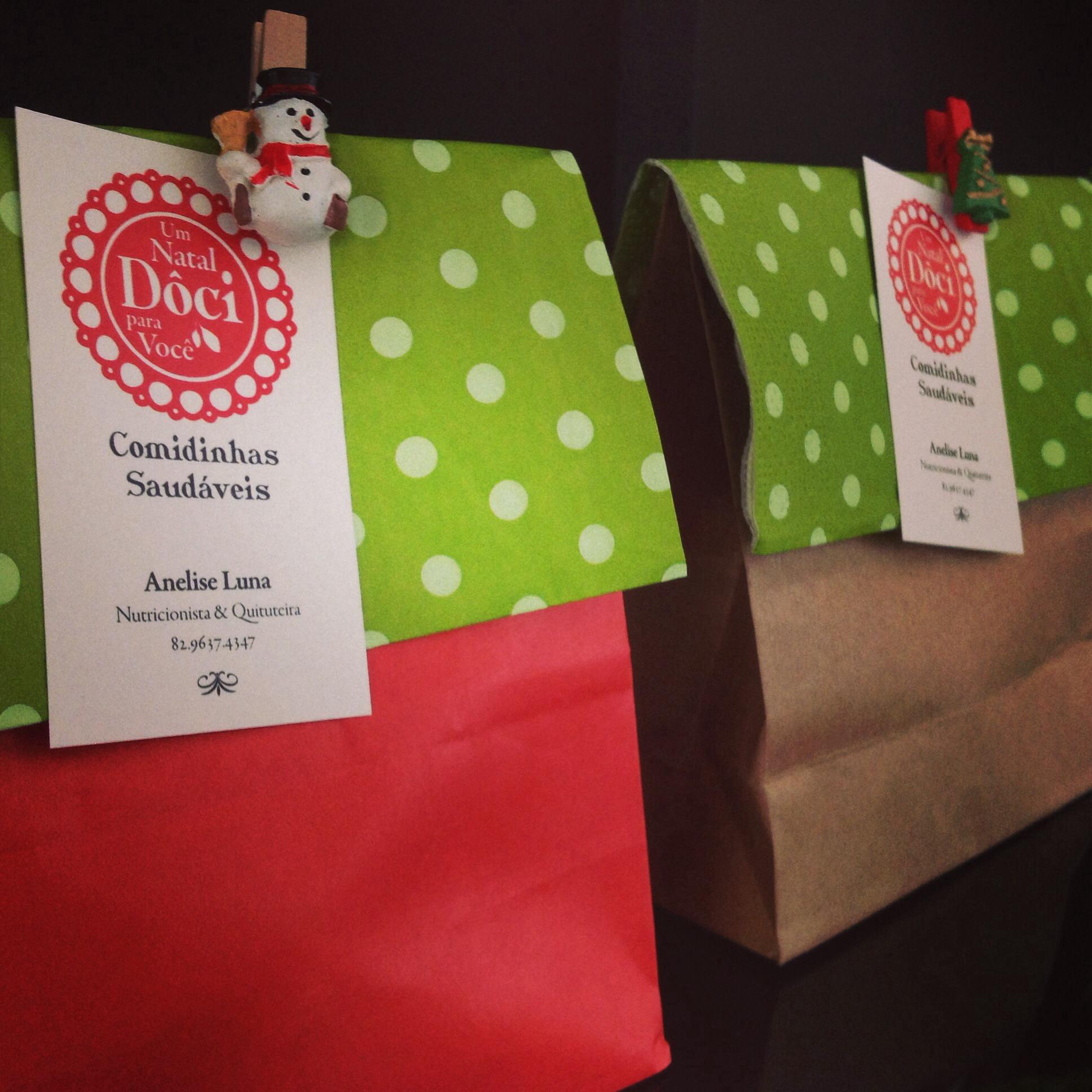
/// Christmas Special Gift Pack: with a numerology booklet for the New Year
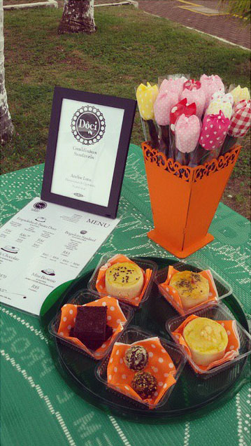
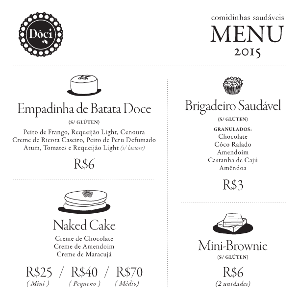
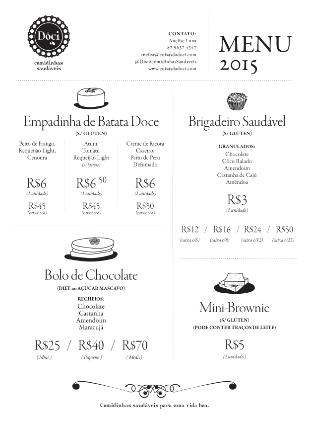
/// Menus
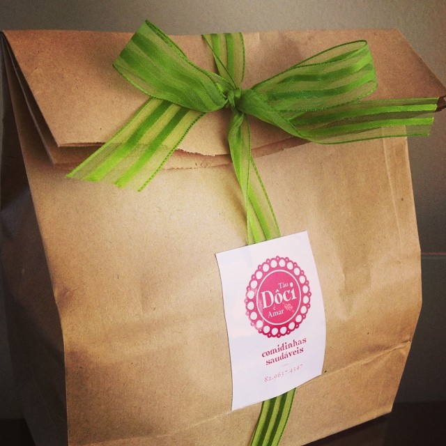
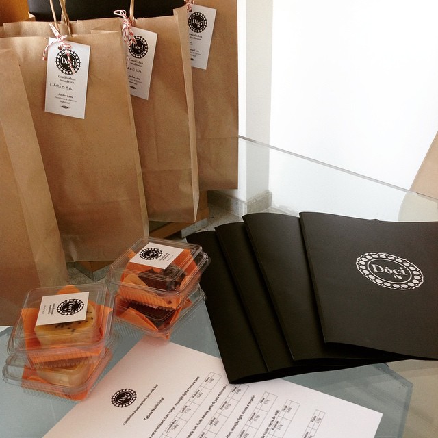
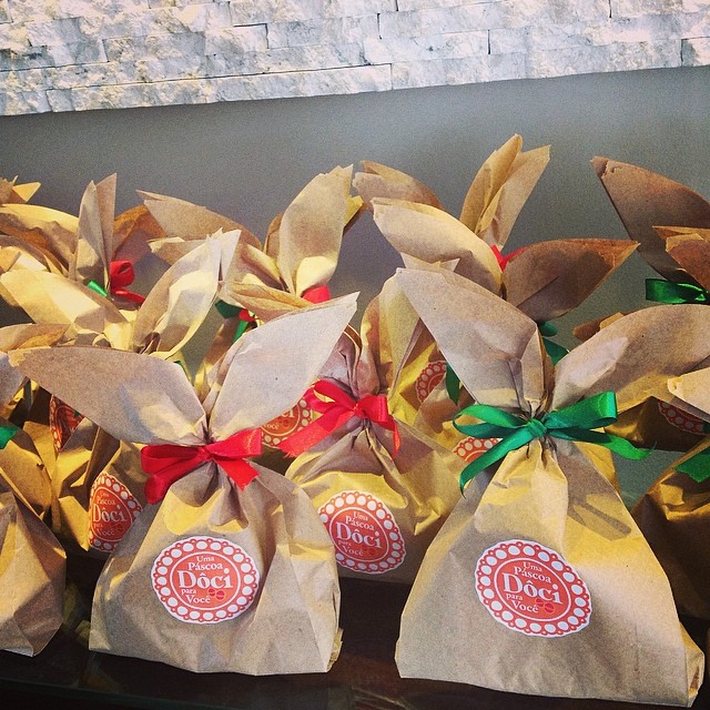
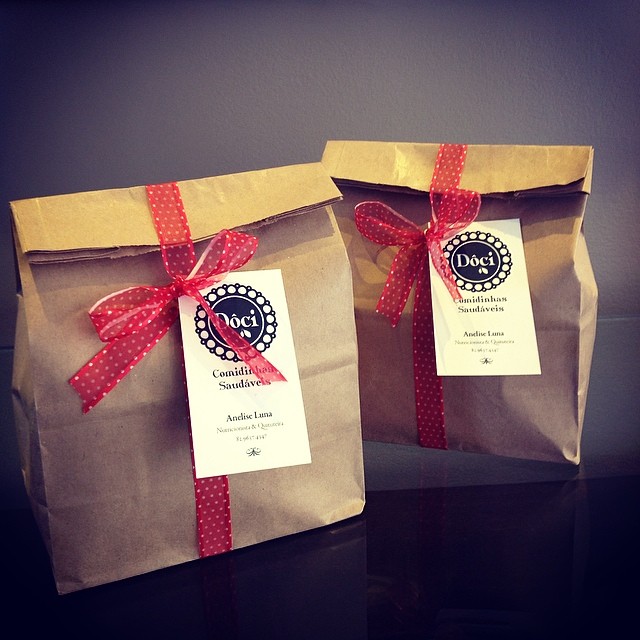
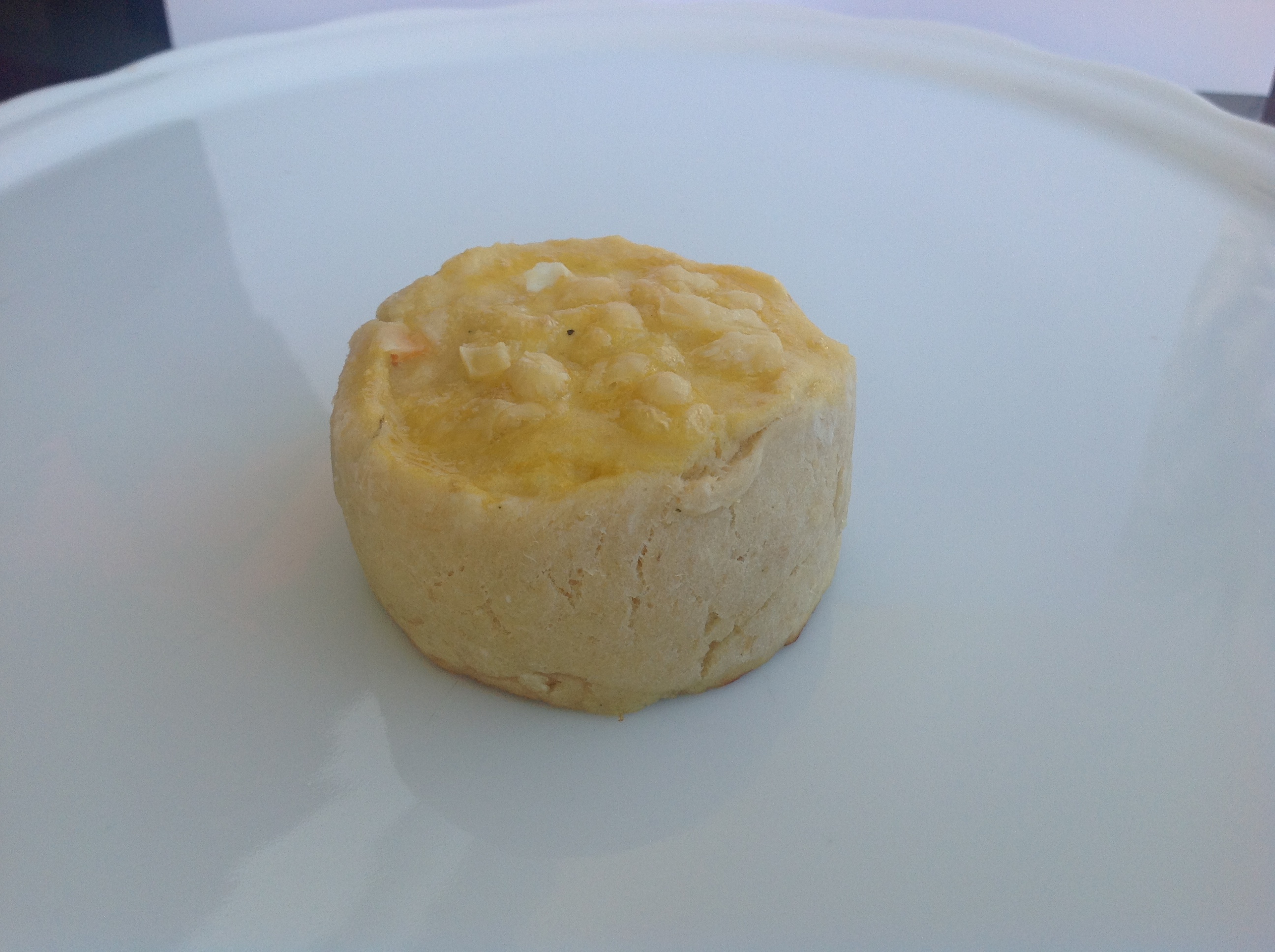
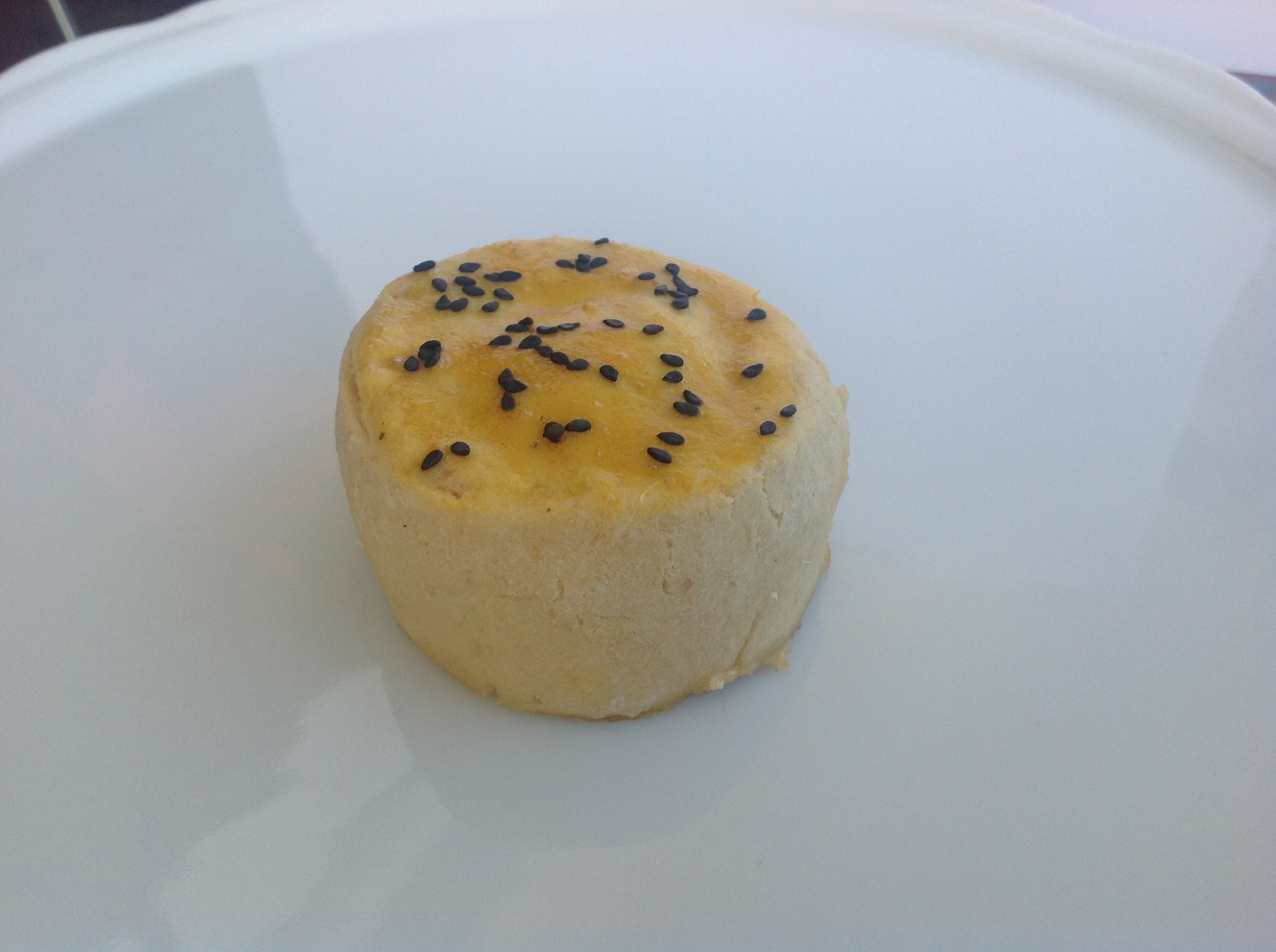
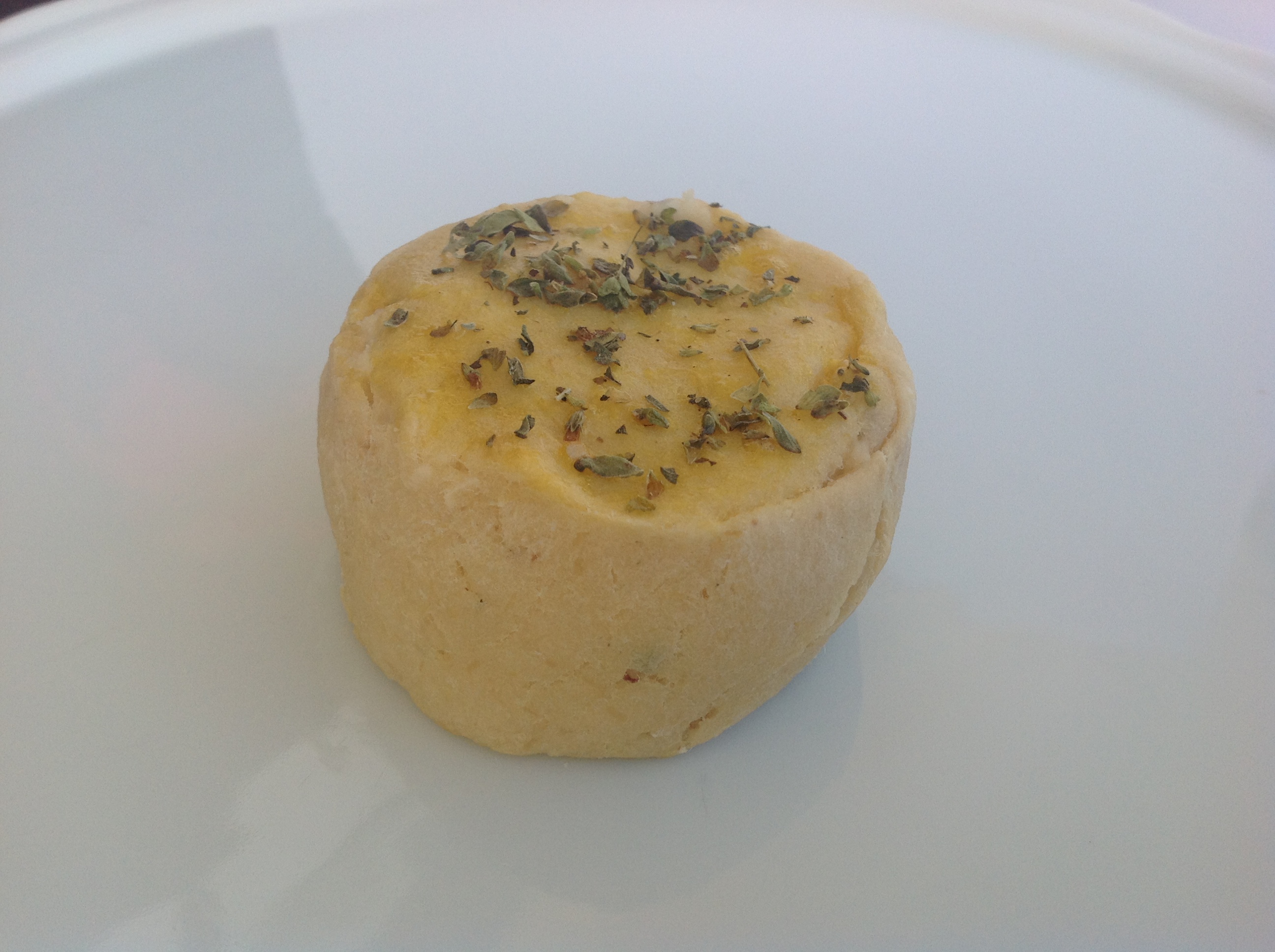
/// More Packaging
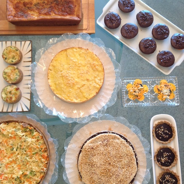
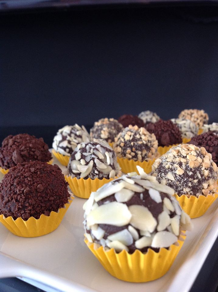
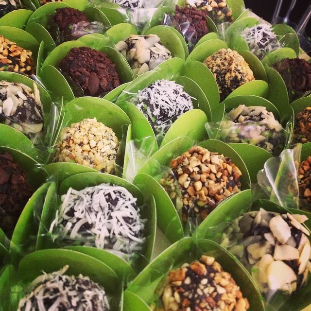
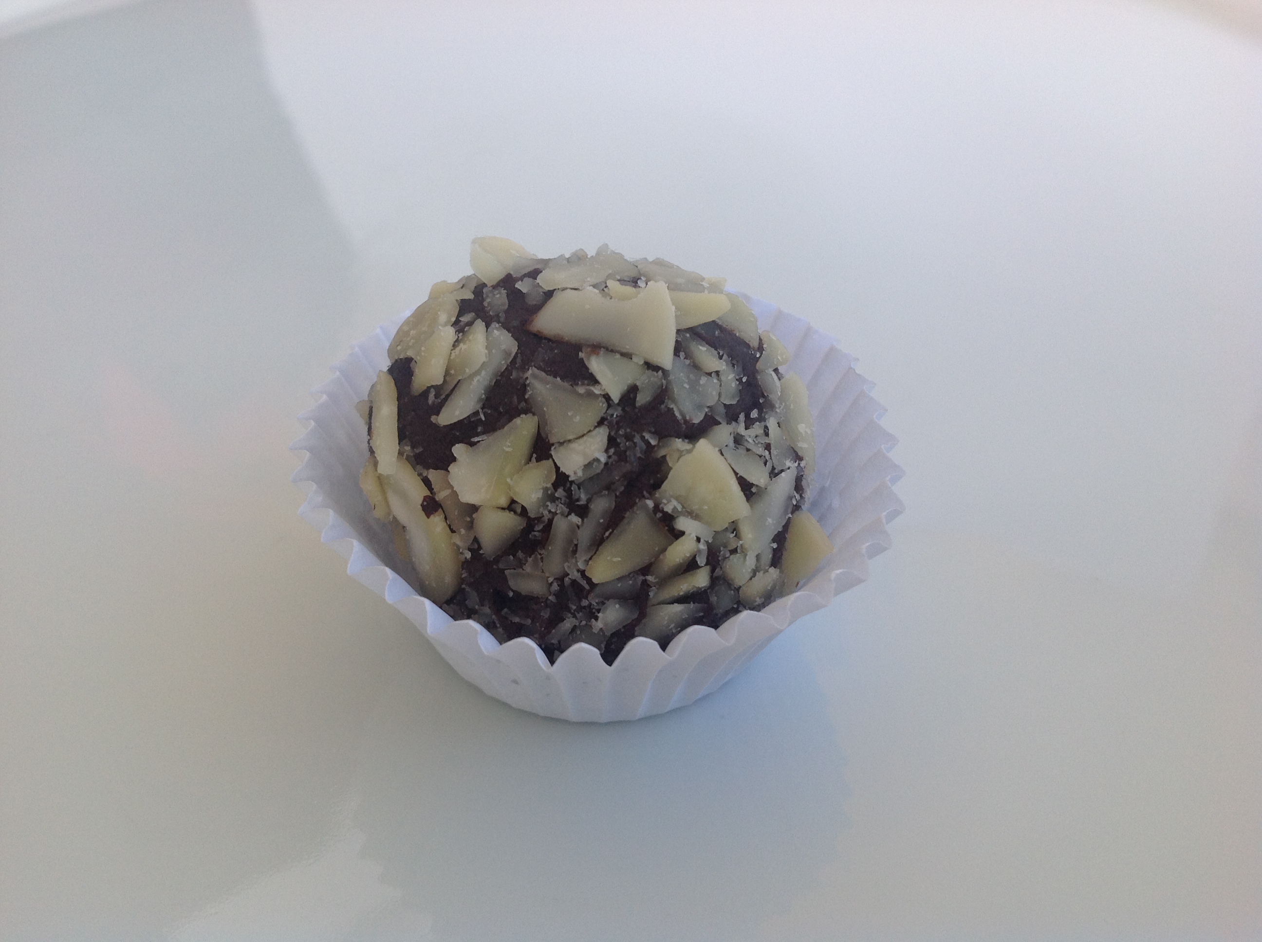
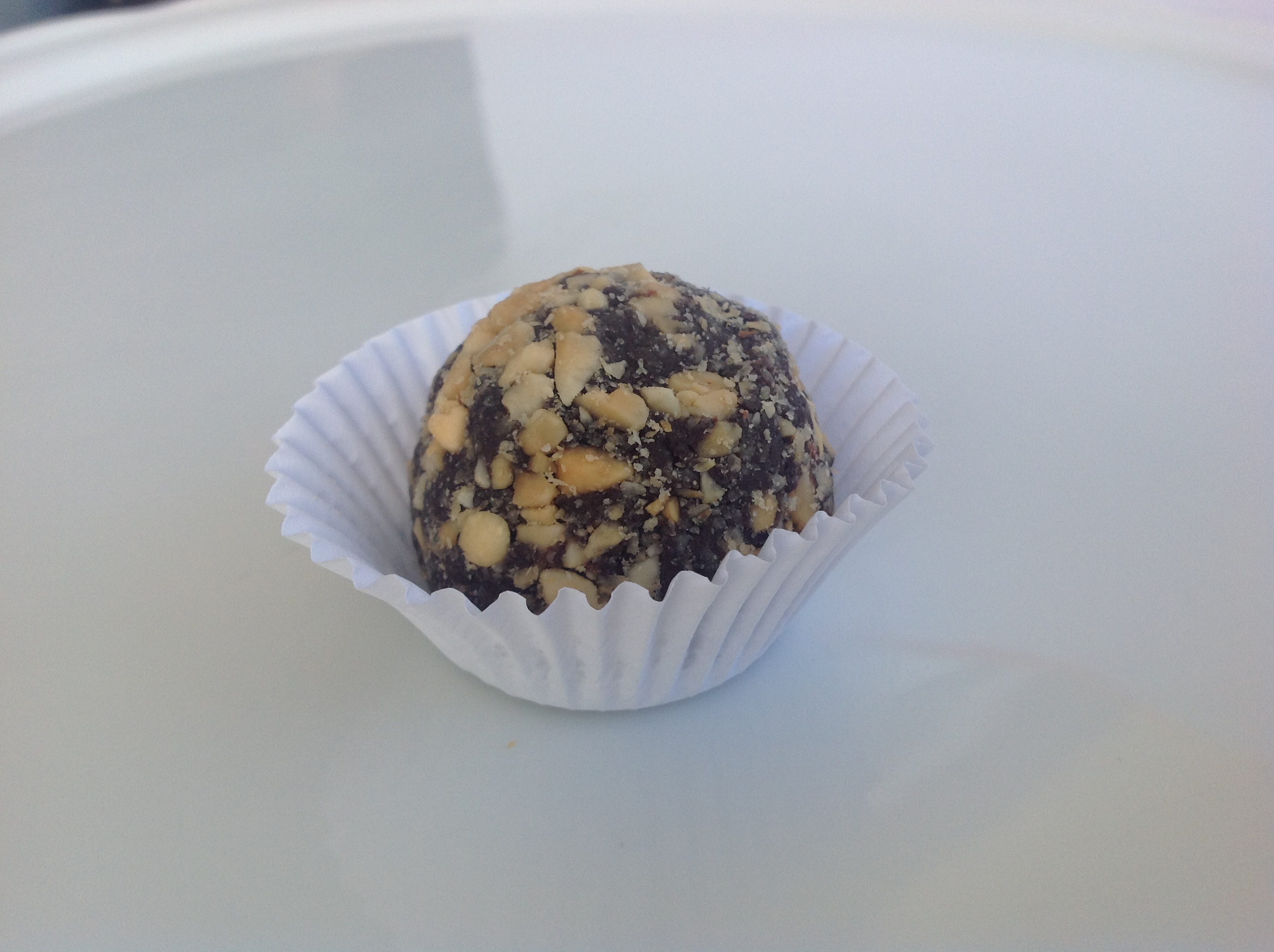
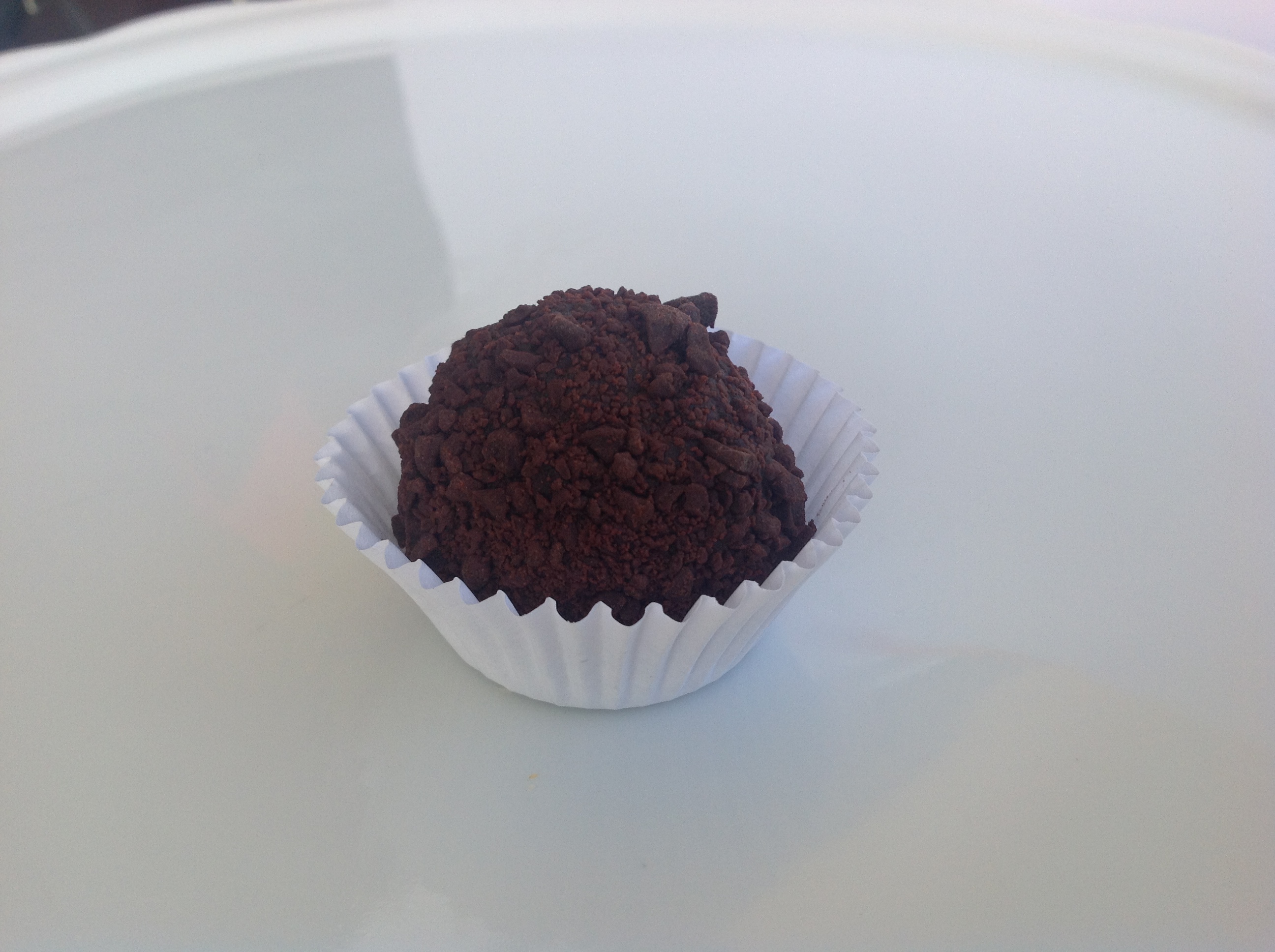
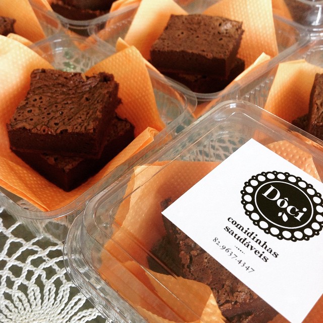
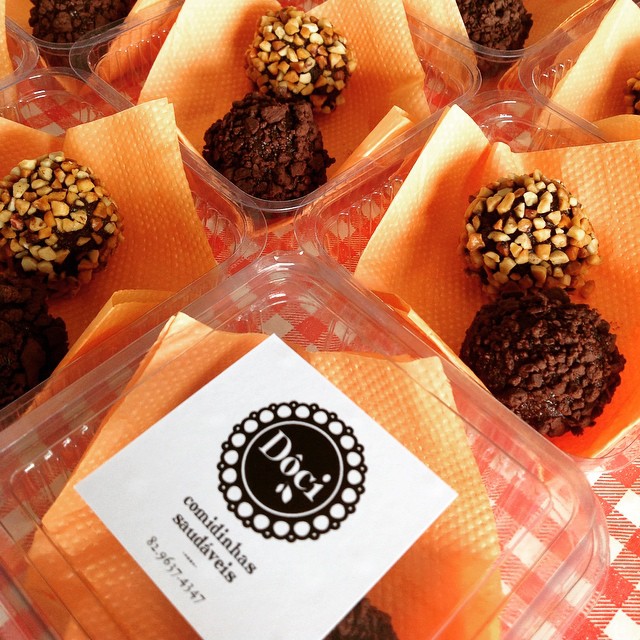
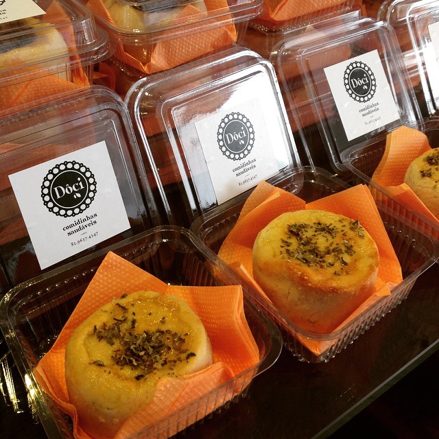
/// The Star of the Show: Brownies, Brigadeiros and Empanadas
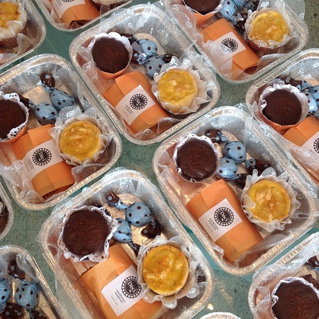
/// Individual Packages or Fun Picnic Packs
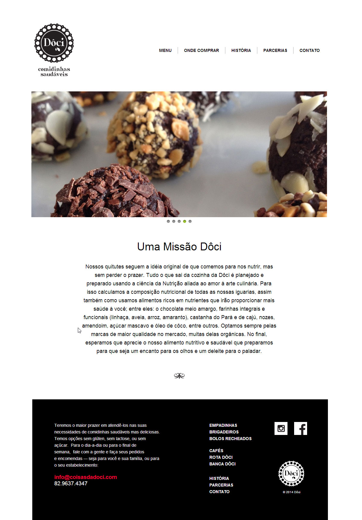
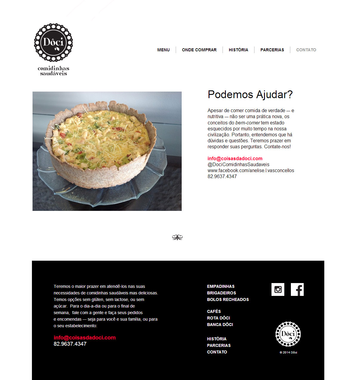
/// Website: www.coisasdadoci.com
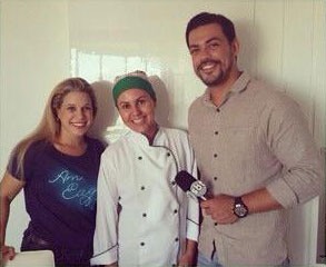
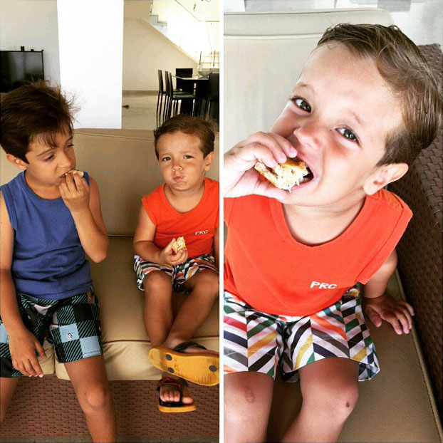
/// Lifestyle & Plugs